
Squarespace Design Decisions That Kill Conversions (Even Though They Look Good)
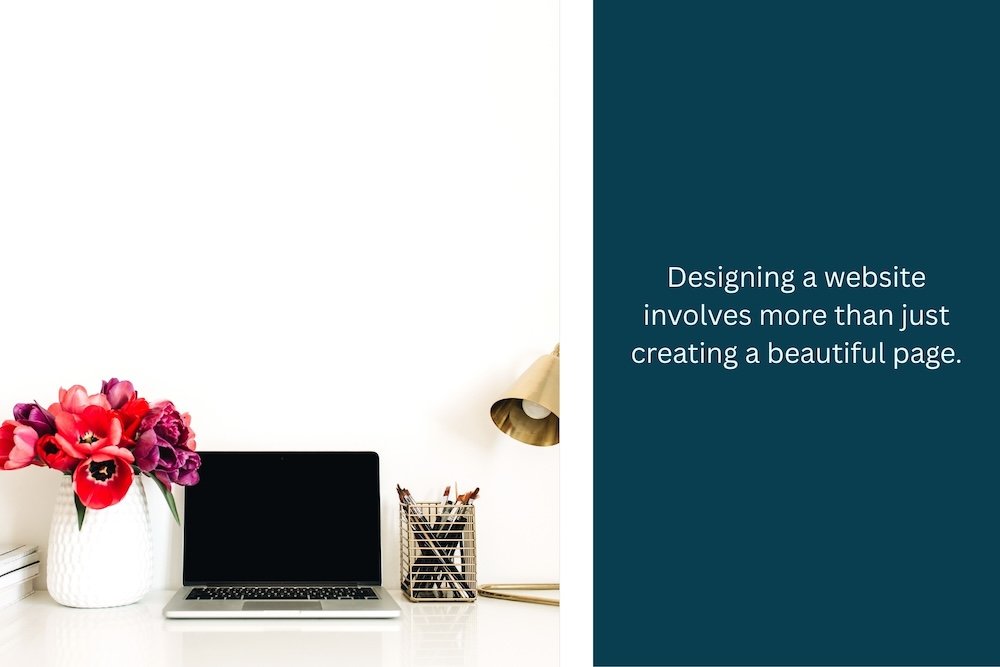
Your Squarespace site looks beautiful. Really, it does! You picked a professional template, you've got nice photos, your branding is consistent, and it feels polished.
But something's wrong: people aren't calling you. They're not filling out contact forms. They're not booking appointments. They're not buying.
The problem isn't that your site looks bad… t's that it converts badly. And here's the tricky part: some of the design decisions that make your site look most professional are the exact decisions killing your conversions.
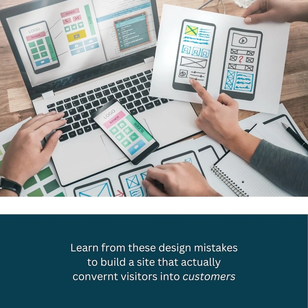
This guide walks you through the design mistakes that hurt conversions, and more importantly, how to fix them while keeping your site looking professional!
This post is part of our Squarespace optimization series:
The Core Problem: Beauty vs. Action
Here's what most DIY site builders don't understand: design that looks good and design that converts are not the same thing.
A designer's job is to make things look beautiful. A conversion expert's job is to make people take action. These goals sometimes conflict.
Example:
Beautiful design: Lots of whitespace, minimal text, subtle colors, minimalist aesthetic
High-conversion design: Clear hierarchy, obvious CTAs, strong visual contrast, compelling copy
Your Squarespace template was designed to look great in a portfolio. It wasn't necessarily designed to maximize your specific business conversions.
So, let's fix that!
Mistake #1: CTA Buttons Hidden in Plain Sight
The Problem:
Your "Contact Us" button blends into your design. It's there, but it doesn't feel urgent or important.
Common CTA placement errors:
Error 1: Too subtle styling
Button is the same color as your navigation
Button blends with your background
Button text is tiny
Button looks like a link, not a button
Error 2: Too far away from the message
User reads "I need to hire a web designer"
They have to scroll to find "Contact" button
Moment of intent passes
Error 3: Only one CTA per page
You have ONE place to click to take action
If they miss it, they're gone
No secondary opportunities
Error 4: CTAs at the bottom only
Most visitors never scroll all the way
Your CTA is invisible to them
Lost opportunity
Why it kills conversions: When someone lands on your page and thinks "I need this," they should have an obvious way to take action immediately. If the CTA is subtle, confusing, or hard to find, they'll assume you're not actively looking for customers.
How to Fix It:
Step 1: Make your primary CTA impossible to miss
On Squarespace:
Go to the button block you want to emphasize
Click on it → Design tab
Make the button:
Larger (at least 50px tall, ideally more)
Bright, contrasting color (should pop against your background)
Bold text (clear and direct: "Schedule Now" not "Learn More")
Rounded corners or distinctive style (stands out)
Color psychology:
Your button should contrast sharply with your background (If your site is light, use a dark button. If dark, use light.)
Green/blue = action/trust
Red = urgency
Orange = excitement
Text matters:
✓ "Schedule a Free Consultation"
✓ "Get Your Free Quote"
✓ "Call Now"
✗ "Submit" (weak)
✗ "Click Here" (generic)
✗ "More Info" (no urgency)
Step 2: Add multiple CTAs strategically
Don't just have one CTA at the bottom. Add them at strategic moments:
Hero section: First CTA within 3 seconds of landing
"Ready to fix your website? Schedule a free audit →"After pain point identification: When they realize they have a problem
"Let's diagnose your site's issues → Book a Consultation"After showing value: After you've shown what you offer
"See if this is right for you → Call Now"At page bottom: Final catch for people who scrolled all the way
"Ready to get started?"Don't worry about "too many CTAs": You're not spamming. You're giving people multiple opportunities to take action at different points in their journey.
Step 3: Make phone numbers clickable on mobile
This is critical and many Squarespace sites miss it.
On Squarespace:
Add your phone number as a button with
tel:+15085551234formatMake it prominent in your header
Ensure it's large enough to tap easily on mobile
Use your business phone number (not generic)
Example:
Header: "(508) 555-1234" (clickable, taps to call on mobile)When someone on mobile wants to call you, ONE TAP should do it. Not "find the number, select it, copy it, paste it into phone."
Step 4: Use directional cues
Subtle visual elements that guide eyes toward CTAs:
Arrows pointing to buttons
Images of people looking at CTAs
Subtle lines leading to buttons
"→" symbols after CTA text
Mistake #2: Hero Section Hides Important Information
The Problem:
Your hero section (the big image/video at the top) is stunning. Unfortunately, it takes up the entire screen, and your actual value proposition is hidden below it.
What happens:
Someone lands on your site
They see a beautiful hero image
They have NO IDEA what your business does
They scroll down (or they leave)
Why it kills conversions: Within 3 seconds, a visitor should know:
What you do
Who you serve
Why they should care
If your hero section is just a pretty picture with minimal text, they have to keep reading to find this out.
How to Fix It:
Step 1: Make your hero text prominent and clear
Your hero section should have:
Clear headline: What you do in 8 words or less
Subheadline: Who you serve or your unique angle
CTA button: First opportunity to take action
Supporting image: Beautiful, but secondary to the message
Not this:
Hero Image: Stunning office photo
Headline: "Welcome"
Subheadline: (blank)
Do this:
Hero Image: Subtle, professional
Headline: "Web Design for Worcester Businesses"
Subheadline: "Beautiful sites that convert visitors into customers"
CTA: "Schedule Free Consultation"
On Squarespace:
Edit your hero block
Customize the text overlay
Make headline large and readable
Add a secondary headline
Add CTA button within the hero
Adjust text color for contrast against image
Step 2: Reduce hero image dominance
Consider these options:
Option 1: Smaller hero
Full-screen hero = visitor might not see anything else
50-60% screen height = hero + content visible without scrolling
Option 2: Image + text side-by-side
Image on one side, text on the other
Both immediately visible
More balanced
Option 3: Hero video with overlay
Video in background
Text overlay clear and readable
More engaging than static image
Step 3: Make sure content is visible below hero
Your hero shouldn't be so large that visitors can't see what's below it.
Test this:
Open your site on a phone
Does the hero take up the entire screen?
Can you see ANY content below it without scrolling?
If no to both, reduce the hero size.
Mistake #3: Too Much Beautiful Whitespace (Starving Your Conversions)
The Problem:
Your designer told you whitespace = sophisticated and modern. They weren't wrong. Your site looks beautiful.
But beautiful doesn't mean effective.
What happens:
Lots of whitespace between sections
Minimal content per page
Lots of scrolling required
Sparse, elegant feel
Visitors: "Is there actually information here?"
Why it kills conversions: Whitespace is good in moderation. But excessive whitespace makes your site feel:
Empty
Like there's not much content
Like you're hiding information
Less credible (more content = more expertise)
Visitors are often trying to solve a problem quickly. If your site feels sparse and requires lots of scrolling to find information, they'll go to a competitor.
How to Fix It:
Step 1: Identify whitespace waste
Look at each section of your site:
Is there blank space that doesn't serve a purpose?
Are you scrolling more than 3 times to get key information?
Does each section have 1-2 sentences when you could say more?
Step 2: Fill strategic whitespace with content
Don't do this:
Section: "About Us"
[Beautiful large image taking up 80% of space]
[One sentence of text]
[Whitespace]
Do this:
Section: "About Us"
[Image on left 40%, text on right 60%]
Headline: "Why We're Different"
- 2-3 sentences about your experience
- Credentials/proof
- [CTA button]
Step 3: Use grid layouts efficiently
On Squarespace, use columns effectively:
Full-width sections: Use for major headers/CTAs only
Two-column layouts: Content + image, or content + form
Three-column layouts: Multiple benefits, services, or features
Text-heavy sections: Use columns to break up the visual
Step 4: Density testing
Ask yourself:
"Is there enough information here to convince someone?"
"Does this section answer key questions?"
"Would this section drive a decision?"
If not, add more content (text, images, or proof points).
Mistake #4: Information Hierarchy Is Confusing
The Problem:
Everything on your page looks equally important.
Your main headline is the same size as secondary headlines
Important benefits blend with nice-to-know information
Key proof points are buried in a list
Visitors don't know what to focus on
Why it kills conversions: Humans scan, they don't read. They look for:
What's the headline?
What's the most important takeaway?
What should I do?
If everything is the same visual weight, they can't scan efficiently and will likely leave.
How to Fix It:
Step 1: Establish clear visual hierarchy
Most important → Largest and boldest
Main headline: 48px+ bold
Primary message
One thing per page
Important → Medium size and weight
Section headers: 32px
Key benefits
Important info
Supporting → Smaller and lighter
Body text: 16px regular
Descriptions
Context
Nice-to-know → Small and light
Small details
Fine print
Additional context
On Squarespace:
Use heading blocks (H1, H2, H3, etc.)
Not just styling text to look like a header
Use the text-size controls to scale appropriately
Step 2: Use visual emphasis strategically
Tools to guide attention:
Color: Highlight key points with color (use sparingly)
Bold text: Emphasize important phrases within paragraphs
Boxes/cards: Put important info in visually distinct containers
Icons: Use small icons to mark key benefits
Numbers: Call out statistics or metrics prominently
Lists: Use bullets for multiple benefits (easier to scan)
Step 3: The "squint test"
Open your page
Squint at it (blurs details)
What do you see?
Can you identify the main message?
Can you see 3-5 key points?
Is there a clear CTA?
If not, adjust your hierarchy.
Mistake #5: Trust Signals Are Missing or Hidden
The Problem:
You have great credentials, testimonials, or proof of your work. But they're buried in small text at the bottom of the page, or they're missing entirely.
What visitors think:
"Hmm, I don't see any proof this is legitimate"
"No testimonials? Are they new?"
"Where are the results/examples?"
"This could be a scam" (subconscious)
Why it kills conversions: Before someone takes action (calling, filling out a form, buying), they need confidence that:
You're real and legitimate
Others have used you and were happy
You deliver on what you promise
You know what you're doing
Mistake: Trust signals are optional extras. They're not. They're essential.
How to Fix It:
Step 1: Identify your trust signals
What proof do you have that you're trustworthy?
Testimonials/reviews:
Client quotes
Star ratings
Case studies
Before/after results
Credentials:
Years in business
Certifications
Awards
Media features
Speaking engagements
Social proof:
Number of customers served
Google reviews (with star rating)
Instagram followers
Email subscribers
Success metrics ("100+ websites built")
Step 2: Place trust signals strategically
Not like this:
Page: Long sales message
Bottom of page: "See what customers say"
Tiny review section with 2 quotes
Do like this:
Hero: Main message + CTA
Section 2: Problem you solve
Section 3: How you solve it
Section 4: PROOF (testimonials, case study, results)
Section 5: CTA ("Let's work together")
Bottom: More proof
Trust signals should appear early and often, not just at the bottom.
Step 3: Make testimonials prominent
When you include testimonials:
Show the customer's name (not anonymous)
Include their photo (if possible)
Add their title/business (establishes they're real)
Include specific results ("Increased leads by 40%" vs. "Really good service")
Make text large enough to read easily
Example:
"Studio 3 Elm rebuilt our website and we've gotten 3x more
customer inquiries. They understood what we needed before
we even told them."

— Sarah Johnson, Johnson HVAC Worcester, MA
[Sarah's photo]
Not like this:
"Great service!" — S.J.Step 4: Use star ratings
If you have Google reviews, display them:
Your average star rating
Number of reviews
Link to see full reviews
On Squarespace:
Use code injection to display your Google review rating
Or manually display your rating in an image/text block
Seeing "4.8 stars | 47 reviews" is powerful social proof.
Mistake #6: Mobile vs. Desktop Optimization Creates Poor Mobile Experience
The Problem:
Your site looks great on desktop. On mobile? It's a different story.
Common issues:
Text is too small to read
Buttons are too small to tap
Content is crammed horizontally
Images don't resize properly
Forms are impossible to fill out
Menu is hidden and hard to access
Why it kills conversions: 60%+ of traffic is mobile. If your mobile experience is poor, you're losing the majority of potential customers.
How to Fix It:
Step 1: Test your site on actual phones
Don't just test in a browser's mobile preview. Test on real phones:
iPhone (various sizes)
Android phone
What to test:
Can you read text without zooming?
Can you tap buttons easily?
Does the page load quickly?
Can you fill out forms with mobile keyboard?
Are images displaying properly?
Is navigation accessible?
Step 2: Ensure mobile-friendly design
Squarespace does this automatically for most things, but verify:
Text size: Minimum 16px for body text (Squarespace may be too small)
Button size: At least 44px tall, easily tappable
Image sizing: Responsive (scales to screen width)
Form fields: Large enough to tap
Phone numbers: Clickable (tel: link)
No horizontal scrolling (content shouldn't require scrolling left/right)
Step 3: Optimize mobile-specific elements
Menu:
Mobile menu (hamburger) should be easy to open and close
Menu items easy to tap
No nested menus that are hard to navigate
Forms:
One field per line on mobile
Mobile-appropriate keyboard (number field = number pad, email = @ symbol, etc.)
Clear submit button
CTAs:
Prominent phone button in mobile header
Click-to-call functionality on all phone numbers
Sticky CTA button that stays visible while scrolling (optional but effective)
Step 4: Test forms on mobile
Fill out your contact form on a phone
Test file uploads (if applicable)
Verify confirmation messages appear
Check email notifications work
Many form issues only show up on mobile.
Mistake #7: Weak Color Contrast Reduces Readability (And Conversions)
The Problem:
Your design has beautiful subtle colors. Light gray text on light background. Thin, elegant fonts.
Looks sophisticated. Impossible to read.
Why it kills conversions:
Visitors can't read your key message
Visitors with vision challenges can't read anything
You fail accessibility standards
People leave because reading is too hard
How to Fix It:
Step 1: Check your contrast ratios
Use a free tool: WebAIM Contrast Checker
Paste your colors in. It tells you if they meet accessibility standards.
Minimum contrast:
Regular text: 4.5:1 ratio (WCAG AA standard)
Large text (18px+): 3:1 ratio
Graphics/icons: 3:1 ratio
Simple test:
Read your page text
Can you read it comfortably?
Does it feel easy or do you have to squint?
If you squint, your contrast is too low.
Step 2: Dark text on light background, or vice versa
Always ensure:
Dark text on light background, OR
Light text on dark background
Never:
Medium text on medium background
Light gray on light background
Thin text on low-contrast background
Step 3: Make important text darker/bolder
Headlines should be darker than body text. Buttons should have strong contrast.
Step 4: Test your colors on different devices
Colors look different on:
Phone screens vs. monitors
Bright sunlight vs. indoors
Different devices (iPhone vs. Android)
View your site on multiple devices to verify readability.
Mistake #8: Navigation Pattern Confuses Visitors
The Problem:
Your navigation menu doesn't work the way visitors expect.
Common issues:
Menu items are vague ("Services" instead of specific services)
Too many menu items (20+ options)
Nested dropdowns that don't work well on mobile
Important pages are hard to find
"Contact" is buried instead of prominent
Back button doesn't work as expected
Why it kills conversions: Visitors land on your site and within seconds ask: "How do I contact this person?"
If contact info is hard to find, they'll leave.
How to Fix It:
Step 1: Simplify your navigation
Ideal menu structure:
Home
About/Services
Blog (optional)
Contact
That's it. 5 items max.
If you have multiple services: Create a dropdown under "Services":
Service 1
Service 2
Service 3
But not sub-dropdowns beyond that.
Step 2: Make contact prominent
Options:
"Contact" as main menu item
"Schedule Now" as button in header
Phone number as button in header
All of the above
Contact should be one click away from any page.
Step 3: Use clear, specific labels
Not this:
"Offerings"
"Solutions"
"Capabilities"
"What We Do"
Do this:
"Services" or specific service names
"About"
"Work" or "Portfolio"
"Blog"
"Contact"
Step 4: Make important pages visible
Never hide your main offer behind navigation.
Example:
Service page should be 1 click from homepage
Contact info should be always accessible
Main CTA should be obvious
Step 5: Mobile menu must be intuitive
Squarespace handles mobile navigation pretty well, but verify:
Menu opens easily
Menu closes easily
Items are tappable (not cramped)
No double-tapping required
Mistake #9: Above-the-Fold Decisions Bury Your Message
The Problem:
"Above the fold" = what people see without scrolling.
Your above-the-fold space includes:
Hero section
Headline
Main message
Sometimes initial CTA
Mistake: You don't use this space effectively.
Examples:
Large image takes up 80% of space
Vague headline like "Welcome"
No clear CTA visible
No indication of what you do
Why it kills conversions: Many visitors make a snap judgment in the first 3 seconds:
"Is this relevant to me?"
"Do they have what I need?"
"Should I scroll down?"
If the above-fold area doesn't answer these, they leave.
How to Fix It:
Step 1: Use above-the-fold for your most important message
Within 3 seconds of landing, visitors should know:
What you do (clearly)
Who you serve (so they know it's for them)
Why they should care (the benefit/problem solved)
What to do next (CTA)
Example:
Headline: "Web Design for Massachusetts Service Businesses"
Subheadline: "Get found on Google. Convert visitors into customers."
CTA: "Schedule Free Consultation"
Within 3 seconds:
They know what you do (web design)
They know who you serve (Massachusetts service businesses)
They know benefits (get found, convert customers)
They know what to do (schedule consultation)
Step 2: Reduce above-the-fold image dominance
If your hero image takes up the entire screen:
Make it smaller (60% of screen height)
Allow content to be visible below without scrolling
Balance image with text
Step 3: Never rely on visitors scrolling
Don't put critical information below the fold expecting people to scroll.
Critical information:
What you do
Who you serve
Main benefits
Primary CTA
These should all be visible above the fold.
Mistake #10: Too Many Font Sizes and Styles (Design Chaos)
The Problem:
Every section uses different fonts:
Heading 1 is one size
Heading 2 is a different size (not obviously smaller)
Body text varies
Buttons use yet another font
Accent text is another size
Result: Visual chaos. No hierarchy. Hard to scan.
Why it kills conversions: Inconsistent typography makes your site look:
Unprofessional
Hard to scan
Confusing (no clear hierarchy)
Like you don't have a design system
How to Fix It:
Step 1: Establish a simple type scale
Define these sizes and stick with them:
H1 (Main headline): 48px
H2 (Section headers): 32px
H3 (Subsection headers): 24px
Body text: 16px
Small text (captions): 14px
Use only these. Every page. Consistently.
Step 2: Limit font families
Use maximum 2 fonts:
1 for headers (could be bold or decorative)
1 for body text (should be readable)
Most Squarespace templates come with good font pairings. Use them. Don't add more.
Step 3: Consistency across pages
Every page should use the same typography:
Homepage headers = Service page headers (same size/style)
Blog posts = About page (same body text)
No surprises
Step 4: Mobile font scaling
Make sure fonts scale appropriately on mobile:
H1 doesn't become unreadable on small screens
Body text is still readable (16px minimum)
Spacing adjusts (headings not squished)
Squarespace handles this pretty well if you use standard heading blocks (not custom styled text).
Putting It All Together: A Conversion-Optimized Page Structure
Here's how a well-optimized Squarespace page should flow:
HERO SECTION (40% screen height)
- Clear headline: "What you do + who you serve"
- Subheadline: The benefit or value prop
- Professional image (but not dominant)
- CTA button: First opportunity to take action
(Visitor should see content below without scrolling)

PROBLEM SECTION
- Headline: Pain point they have
- 2-3 sentences explaining why it's a problem
- Maybe an image
- Clear, readable text

SOLUTION SECTION
- Headline: How you solve it
- 3-4 key benefits (in clear hierarchy)
- Maybe bullet points
- Icons or images supporting benefits
- CTA button: Second opportunity to take action

PROOF SECTION
- Headline: "What our customers say" or "Results"
- 2-3 prominent testimonials (with names/photos)
- Or case study with specific metrics
- Trust signals (awards, certifications, years in business)

NEXT STEPS SECTION
- Headline: Call to action
- Brief explanation of what happens next
- CTA button: Final opportunity to take action
- Phone number for immediate calls

FOOTER
- Contact info (visible everywhere)
- Phone number (clickable)
- Email
- Links to pages
- Social media (optional)
Common Objections (And Why Your Instinct Might Be Wrong)
"But whitespace makes it look more professional..."
More whitespace does not equal more professional. Effective does not equal sparse.
Professional sites convey:
Credibility (proof of work)
Expertise (knowledge demonstrated)
Ease of use (clear navigation)
Not just: "empty space looks sophisticated"
"My designer said this was best practice..."
Design best practices and conversion best practices aren't the same.
Your designer optimized for beauty. You need to optimize for conversions.
These require different approaches.
"More CTAs will look too sales-y..."
Multiple CTAs don't look pushy—they look helpful.
You're giving people multiple opportunities to take action at the moment they're ready.
If they only see one CTA and miss it, they're gone.
"I like the minimalist aesthetic..."
You and your target customer might have different preferences.
You might like minimalist design. Your customers might appreciate clarity and information.
Design for your customers, not for yourself.
Your Action Plan: Audit and Fix
This Week: Honest Audit
Open your site on mobile
Ask yourself:
Can I figure out what you do in 3 seconds?
Is it obvious how to contact you?
Are all buttons easy to tap?
Can I read text comfortably?
Do I see proof that you're trustworthy?
Is there a clear CTA when I'm interested?
Write down every issue
Quick Wins (2-4 hours to implement):
Make your CTA button larger and brighter
Add 2-3 more CTAs strategically throughout the page
Make your phone number clickable (tel: link)
Add one prominent testimonial near your main message
Check text contrast (use WebAIM)
Test your site on an actual mobile phone
Simplify your navigation menu
Bigger Fixes (4-8 hours):
Rewrite your hero section for clarity
Reorganize page sections for better flow
Reduce whitespace in sparse sections
Add trust signals (reviews, credentials)
Improve information hierarchy
Fix mobile form experience
Establish consistent typography
Major Redesign (8+ hours):
Reorganize overall page structure
Rewrite headlines for clarity
Implement better visual hierarchy
Add proof section
Optimize for mobile-first experience
Implement multiple strategic CTAs
The Bottom Line
Your Squarespace site can be both beautiful AND high-converting. These aren't mutually exclusive goals. But they require you to think like a conversion specialist, not just a design enthusiast. The best design is invisible. People don't notice it; they just take action. If your site is beautiful but nobody's contacting you, it's time to prioritize conversions over aesthetics. Start with the quick wins. See what improves. Then tackle bigger issues.
About Studio 3 Elm
Studio 3 Elm helps Central Massachusetts businesses build and optimize Squarespace sites that not only look professional but actually convert visitors into customers. I work with business owners in Worcester, Framingham, Marlborough, and throughout Central Mass who have great sites that aren't generating the results they expected.
Let’s talk about your site!