
Common Squarespace Design Mistakes You Are Making
And How to Fix Them!


You’ve finally carved out time to build your own website on Squarespace. You’ve uploaded your logo, chosen a template, set your site styles, and started adding your pages. At first, it feels exciting! Drag, drop, done! But the deeper you go, the more you realize your site doesn’t look quite how you pictured it. Something feels off. The design looks a little messy, and instead of feeling polished and professional, it feels… homemade.
Don’t worry, you’re not alone. I see a lot of small and local businesses who try to DIY their Squarespace site, and I notice the same design mistakes come up over and over. The good news? These are all quick fixes once you know what to look for. Let’s go through the most common mistakes together (and how to fix them!).
1. A Cluttered Navigation Menu
The mistake: Every page you create ends up in your top navigation bar. The result? Visitors feel overwhelmed, and your site looks cluttered.
The fix: Keep your navigation simple with 4-6 items at most in the Main Navigation menu (on the left hand menu under “Website” select “Pages” and you will see two sections; “Main Navigation” and “Not Linked”). Move any additional pages that should not be in your Main Navigation to the Not Linked section by clicking and dragging them. You can also group related pages together and use dropdown menus instead of cramming everything into the top menu.
In Squarespace, head to Pages.
Select the “+” to the right of “Main Navigation” and scroll all the way down to “Dropdown”
Name the top-level page something broad like “Services” and then add the needed pages.
This instantly makes your site easier to navigate!

2. Too Much Space Between Sections
The mistake: You add text and images, but everything feels like it’s floating in the middle of the page with too much blank space.
The fix: By default, Squarespace adds margins at the top and bottom of each section. To fix this:
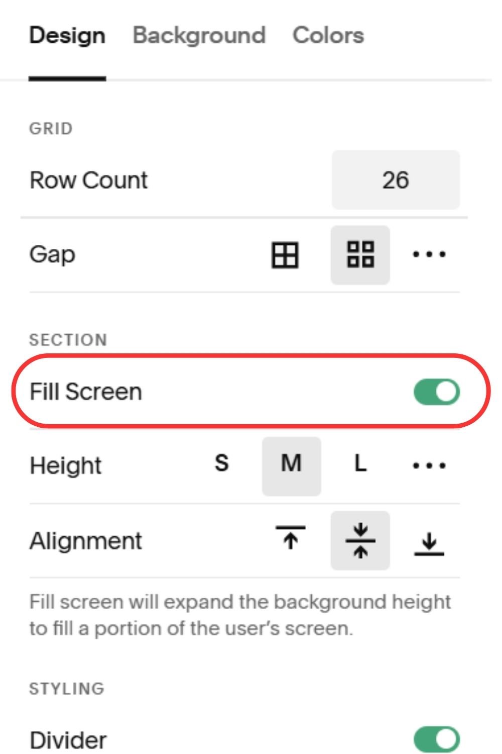
Hover over the section, then click Edit Section.
Toggle off Fill Screen.
Now your grid fills the entire section, and you can align your content at the very top or bottom as needed.
A small tweak, but it makes a big difference in keeping your design balanced and gives you new design options to play with!
3. Not Checking Mobile View
The mistake: Your site looks great on desktop, but on mobile the text is crammed, images are off-center, or buttons are cut off, and where did all that extra space come from? Since most visitors browse on their phones, this is a big issue.
The fix: Always check mobile view before publishing. In the site editor, click the mobile preview icon and adjust as needed.
Want specific pro tips on making your site mobile friendly? I covered this in my previous blog post: How To Optimize Your Squarespace Website For Mobile View.
4. Overusing Stock Photos
The mistake: You want your site to look professional, so you lean heavily on free stock photos. But too many stock images make your site feel generic and impersonal.
The fix: Use stock photos sparingly, and balance them with your own content. Even photos taken on a smartphone can look great if you use natural light and consistent editing. Visitors want to see you and your business. Not the same stock image they saw on five other websites.
5. Forgetting Calls to Action
The mistake: Your site looks pretty, but it doesn’t guide visitors anywhere. They scroll, read, and then… leave.
The fix: Every page should have at least 3 clear call to action (CTA) buttons. Examples:
“Book a Free Consultation”
“Shop Now”
“Contact Us”
Use buttons, not just links, and make sure they stand out.
6. Ignoring Image Ratios
The mistake: Your gallery images or product images look uneven and misaligned because they’re all different shapes and sizes.
The fix: Crop your images to the same aspect ratio before uploading (Squarespace recommends consistent square or portrait ratios for grids). Canva or any basic photo editor works for this!


7. Not Utilizing Section Dividers
The mistake: Your site feels blocky, with one square section stacked on top of another, only separated by different background colors. It looks static and disconnected.
The fix: Use section dividers to add flow and visual interest.
Hover over a section, click Edit Section, and scroll to Section Dividers.
Choose from styles like waves, diagonal, or curves.
Tip: Don’t overdo it. Pick one or two divider styles and sprinkle them strategically throughout your site to acheive cohesion without looking like a craft project gone wrong.
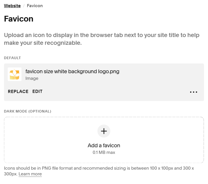
8. Forgetting the Favicon
The mistake: You launch your site, but in the browser tab and search results, it still shows the default Squarespace cube icon. This instantly signals “unfinished” and looks unprofessional.
The fix: Upload your own favicon.
Go to Design → Browser Icon (Favicon).
Upload a small version of your logo or a simple graphic. (If your file size is too large, use Canva to make it smaller before uploading it)
Now, when people bookmark your site or see it in search results, it looks polished and branded.
Final Thoughts
Building your own Squarespace website is an empowering step for your small business! But it’s easy to fall into these common design traps. The good news is that once you know what to look for, the fixes are simple, and your site will instantly look more professional and user-friendly.
And if you start to feel overwhelmed or just want your site to shine without the trial and error? That’s where I come in. Reach out, and I’ll help polish your Squarespace site so you can focus on running your business.