
How to Optimize Your Squarespace Website for Mobile View
5 Pro Tips to Make Your Squarespace Website Responsive On All Screen Sizes


You’ve spent hours, even days, designing your Squarespace site for your small business on your laptop. Carefully arranging images, text, and buttons until it looks just right. You’re almost ready to launch, but first you need to optimize your site for mobile devices. So you switch over to the mobile view editor and start making tweaks. But the design that looked so flawless on your laptop… isn’t translating well to a mobile size screen. The images don’t fit the way you want, when you look at the site on different sized devices text overlaps with photos, huge blank spaces keep appearing, buttons are hard to tap, and the layout just doesn’t feel polished anymore.
If this sounds familiar, you’re not alone. Many small business owners run into the same issue when trying to make their Squarespace site mobile responsive. The desktop editor makes it easy to create something beautiful, but getting it to work just as well on mobile can be frustrating.
That’s why in this post, I’m sharing some lesser-known Squarespace tips to help you make your Squarespace site mobile responsive. With a few adjustments, you can make sure your website looks great (and functions smoothly) on any device.
Why Mobile Optimization Matters
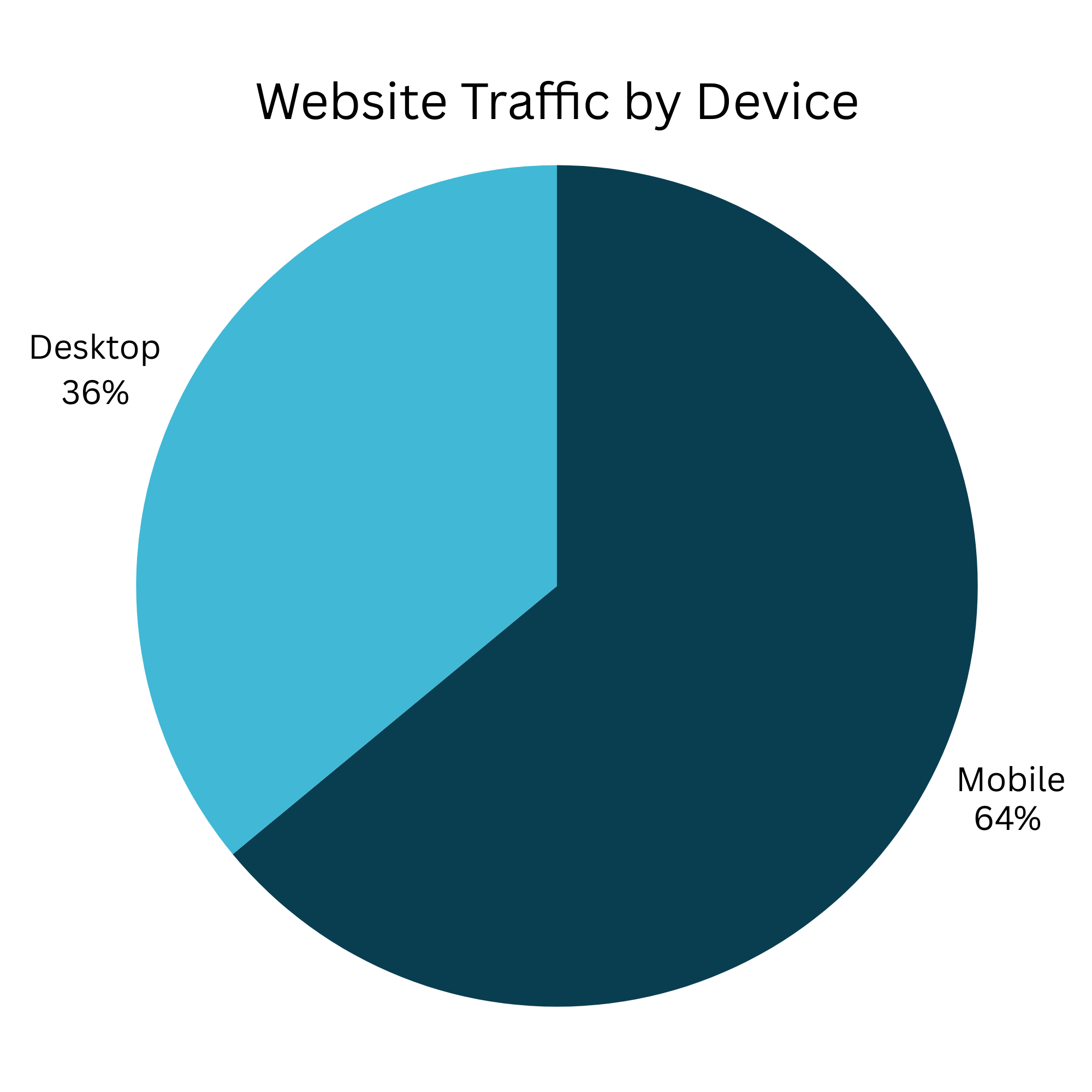
In today’s digital world, your website isn’t just viewed on desktops; it’s most often seen on a phone. In fact, as of 2025, about 64% of all web traffic comes from mobile devices. Google also uses mobile-first indexing, meaning it primarily looks at your mobile site when deciding how to rank you in search results.
What does this mean for you?
User experience: A site that’s hard to read, click, or scroll on a phone sends visitors away fast.
Search rankings: Google prioritizes mobile-friendly sites in its search results.
Conversions: Mobile visitors are often ready to act; calling, booking, or buying directly from their phones. If your website isn’t mobile-friendly, you’re missing out on visitors, potential customers, and valuable search visibility.
A site that’s smooth and easy to navigate on mobile is no longer optional. It’s essential. The good news: Squarespace gives you tools to make your site look great across all device sizes. With a little strategy, you can ensure your mobile site is polished, professional, and SEO-friendly.
Squarespace Mobile Optimization Tips
Here are simple, effective steps you can take inside Squarespace to improve your mobile view:
1. Don’t Overlap Blocks
Overlapping text, images, or videos may look fine on a wide desktop screen, but they can break the design on smaller screens. When the site shrinks or spreads to fill various mobile and tablet screen sizes, the layered blocks can become unaligned from your intentended design. Keep blocks cleanly stacked to avoid scaling issues, or use Canva or Photoshop to get the desired look in one image that will scale reliably.
2. Use Gallery, Carousel, and Grid Blocks
Squarespace’s built-in gallery blocks are designed to adapt to any screen size. Carousels, slideshows, and grids make your content look polished and are easy to update over time.
3. Place Blocks in the Right Order
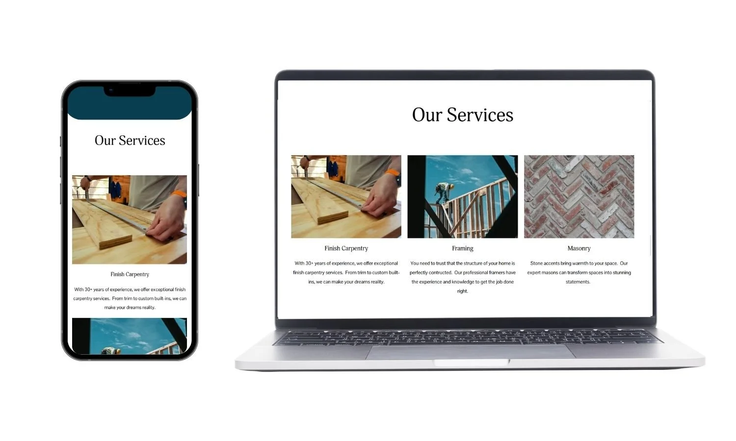
Squarespace stacks content vertically on mobile. As you are building each section, add your blocks in the editor in the order you want them to appear on phones. This saves you from needing to rearrange blocks later.
4. Hide Desktop-Only Elements
If an image block looks amazing on desktop view, but on mobile view it just looks wrong… you can hide that image block by making it as small as possible, and then sending it behind another block. Changing the position and size of the image block on mobile view will not change how you have it on desktop view. So you can keep your perfectly designed desktop view and make your mobile view stunning as well!
5. Customize Your Hamburger Menu
On mobile, your header navigation links become a “hamburger” menu (the horizontal lines in the top right corner that you click on to get to the main navigation). Squaresapce will automatically select a theme color for this menu from your site styles, but it might not look ideal. Make sure the background and text colors are easy to read and look amazing! Once you are in the Edit screen for mobile view, go to Edit Header → View Menu → Edit Design to adjust.
Final Thoughts
Designing your Squarespace site to look great on desktop is an accomplishment. But making it shine on mobile takes an extra layer of care. The tips in this post can help you avoid the frustration of layouts breaking, buttons misaligning, or menus being unreadible on smaller screens.
That said, mobile optimization can feel overwhelming when you’re trying to juggle everything else in your business. If you’ve tried these tips and your site still isn’t coming together, don’t worry! You don’t have to figure it out alone. I specialize in helping small business owners turn their Squarespace sites into professional, mobile-friendly websites. Reach out anytime if you’d like support making your site look just as polished on a phone as it does on your laptop.